User Testing
The redesign process began with user research that included small testing intervals to understand how both new and experienced users actually navigate the platform and where they get stuck. Although the user testing phase was short, I asked questions of where users might bet frustrated throughout the process while gather new feedback on what features they with to see on the site.
Designing
Through mood-boarding the cinematic aesthetic that defines Letterboxd's identity was determined to stay consistent so not too much had changed for existing users. After the research, countless sketches and wireframes were designed, all with different approaches to organizing content and simplifying navigation flows. Sketches and wireframes were created using the fun bold color pallets of the initial brand with some additions, the dark grey backgrounds were continuous as well for the users to use in any theater or area without the screen hurting their eyes and ti maintain accessibility standards that the previous version of the site had. Balancing the visuals, statistics and reviews/text was a choice that allows a wide spread of user to enjoy the redesign.
Design Process
Design and Development
Design and Development
Design and Development
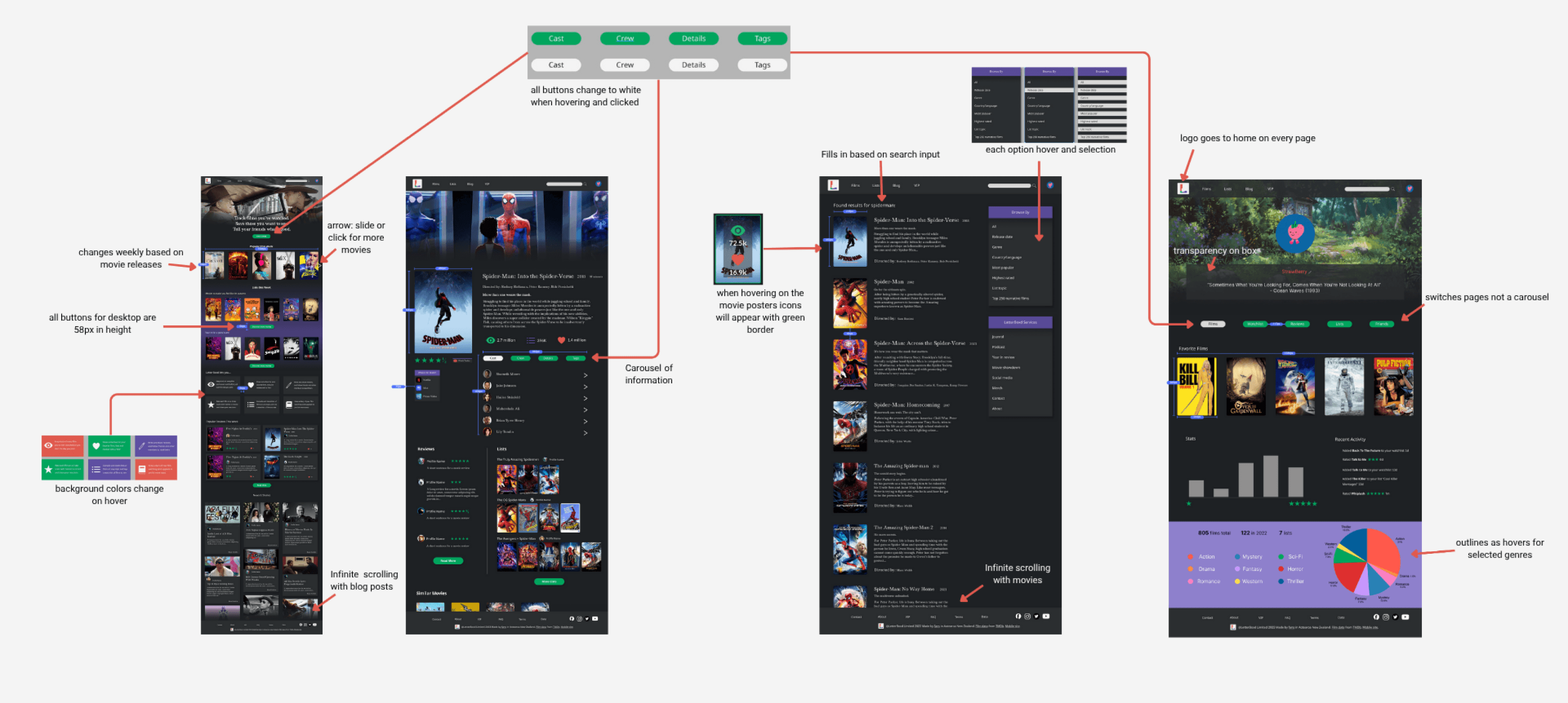
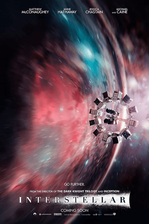
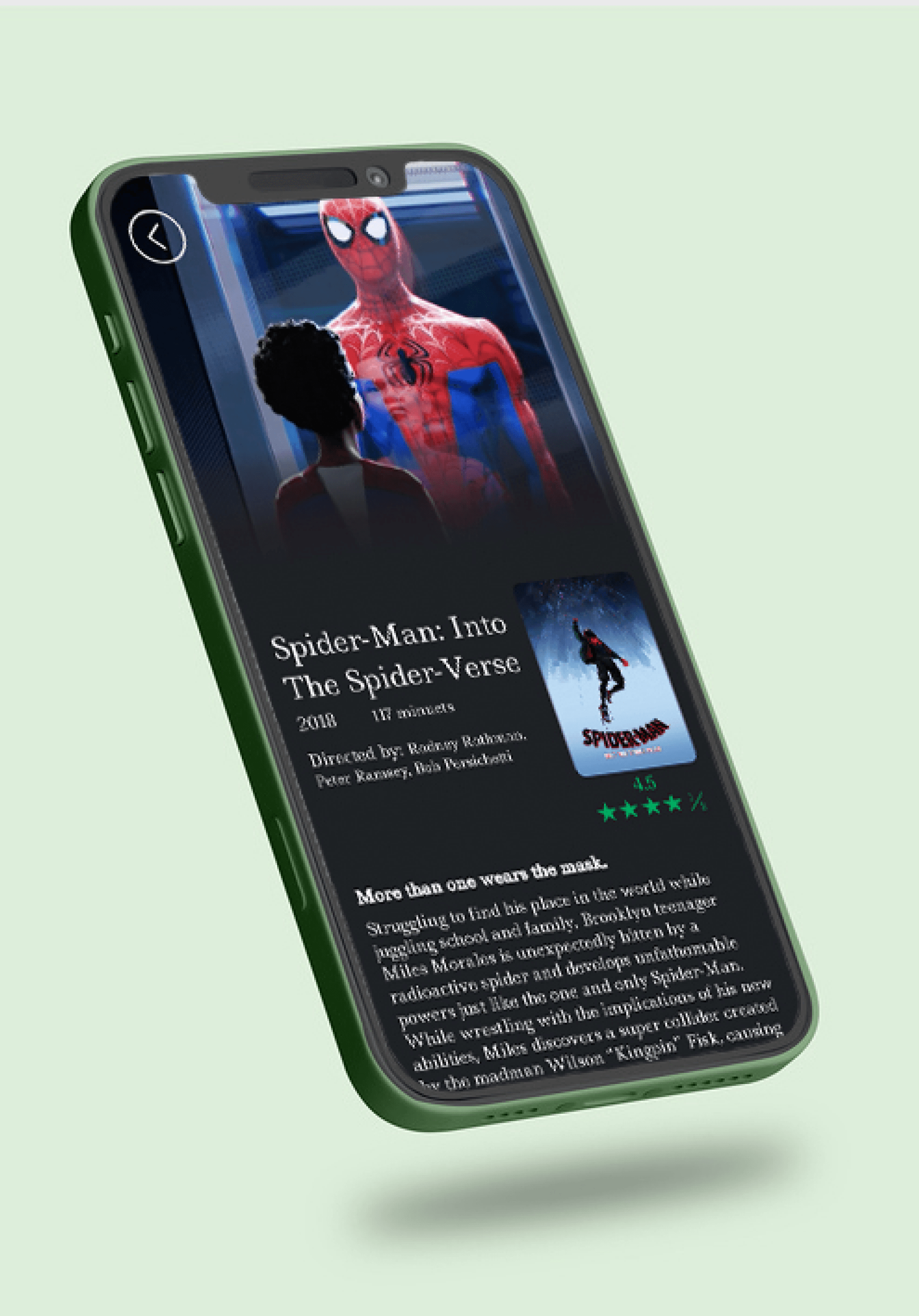
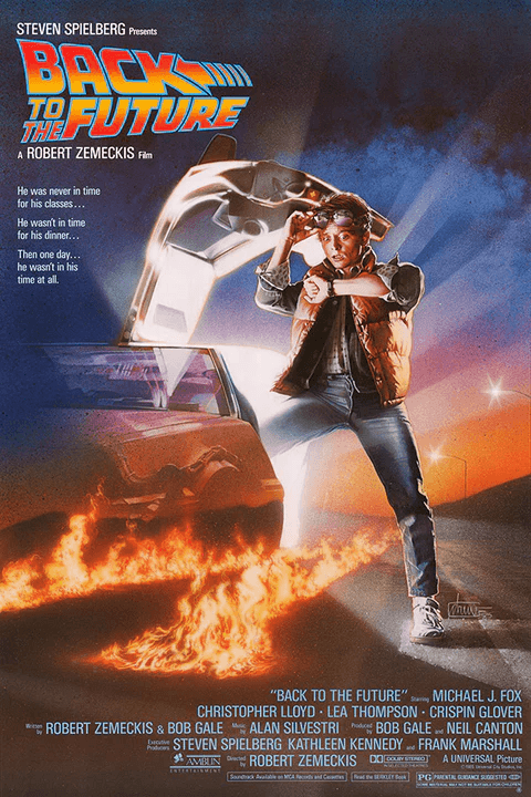
The prototyping phase added additional animations of smooth transitions between film cards, subtle hover effects that make browsing feel more engaging, and scroll-triggered animations that gradually reveal content, all add a new depth to the site. The animations help guide users through the interface naturally, making the transition from discovery to engagement feel effortless. To complete the project, I developed a comprehensive developer handoff with detailed specifications of the user interface and hover interactions on specific sections and other important information needed when it passes into development.
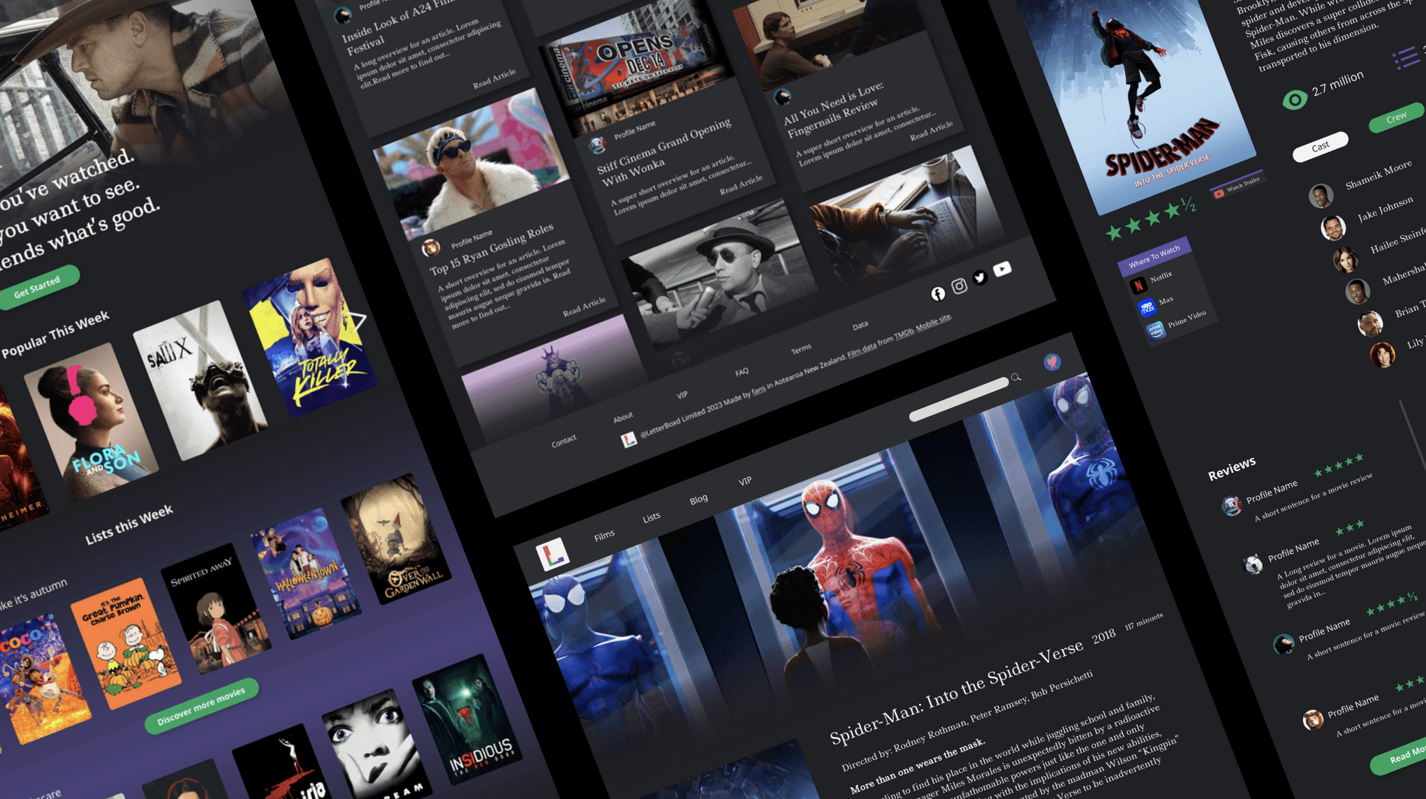
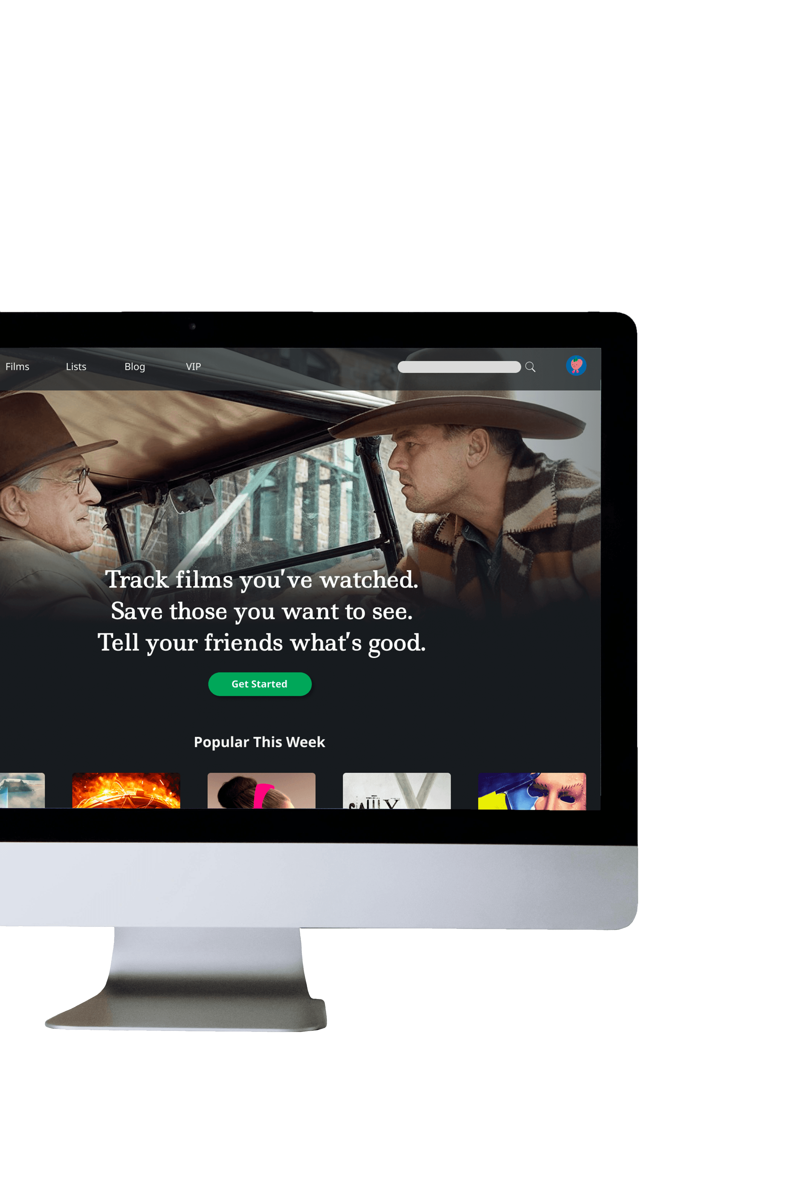
This Letterboxd redesign was rooted in honoring what makes the platform special while fixing the overall experience and accessibility issues. The original interface consisted of inconsistent layouts, navigation, and a visual hierarchy that made discovering great films feel like work rather than joy. My redesign streamlines the experience with cohesive design patterns, intuitive navigation flows, and a clean visual system that lets the films and community take center stage.
Whether you're a longtime cinephile or someone just discovering the joy of film logging Letterboxd has created a space for what really matters: sharing movies with others and creating a welcoming community.
Creative Vision
Creative Vision
Creative Vision
A redesign Where film passion meets seamless discovery
A redesign Where film passion meets seamless discovery
Letterboxd
Letterboxd
Letterboxd
Letterboxd

desktop
mobile
UI/UX design
The prototyping phase added additional animations of smooth transitions between film cards, subtle hover effects that make browsing feel more engaging, and scroll-triggered animations that gradually reveal content, all add a new depth to the site. The animations help guide users through the interface naturally, making the transition from discovery to engagement feel effortless. To complete the project, I developed a comprehensive developer handoff with detailed specifications of the user interface and hover interactions on specific sections and other important information needed when it passes into development.
The prototyping phase added additional animations of smooth transitions between film cards, subtle hover effects that make browsing feel more engaging, and scroll-triggered animations that gradually reveal content, all add a new depth to the site. The animations help guide users through the interface naturally, making the transition from discovery to engagement feel effortless. To complete the project, I developed a comprehensive developer handoff with detailed specifications of the user interface and hover interactions on specific sections and other important information needed when it passes into development.
UI/UX design
UI/UX design
mobile
mobile
desktop
desktop
This Letterboxd redesign was rooted in honoring what makes the platform special while fixing the overall experience and accessibility issues. The original interface consisted of inconsistent layouts, navigation, and a visual hierarchy that made discovering great films feel like work rather than joy. My redesign streamlines the experience with cohesive design patterns, intuitive navigation flows, and a clean visual system that lets the films and community take center stage.
Whether you're a longtime cinephile or someone just discovering the joy of film logging Letterboxd has created a space for what really matters: sharing movies with others and creating a welcoming community.
User Testing
The redesign process began with user research that included small testing intervals to understand how both new and experienced users actually navigate the platform and where they get stuck. Although the user testing phase was short, I asked questions of where users might bet frustrated throughout the process while gather new feedback on what features they with to see on the site.
Designing
Through mood-boarding the cinematic aesthetic that defines Letterboxd's identity was determined to stay consistent so not too much had changed for existing users. After the research, countless sketches and wireframes were designed, all with different approaches to organizing content and simplifying navigation flows. Sketches and wireframes were created using the fun bold color pallets of the initial brand with some additions, the dark grey backgrounds were continuous as well for the users to use in any theater or area without the screen hurting their eyes and ti maintain accessibility standards that the previous version of the site had. Balancing the visuals, statistics and reviews/text was a choice that allows a wide spread of user to enjoy the redesign.
Contact ME
Contact ME
User Testing
The redesign process began with user research that included small testing intervals to understand how both new and experienced users actually navigate the platform and where they get stuck. Although the user testing phase was short, I asked questions of where users might bet frustrated throughout the process while gather new feedback on what features they with to see on the site.
Designing
Through mood-boarding the cinematic aesthetic that defines Letterboxd's identity was determined to stay consistent so not too much had changed for existing users. After the research, countless sketches and wireframes were designed, all with different approaches to organizing content and simplifying navigation flows. Sketches and wireframes were created using the fun bold color pallets of the initial brand with some additions, the dark grey backgrounds were continuous as well for the users to use in any theater or area without the screen hurting their eyes and ti maintain accessibility standards that the previous version of the site had. Balancing the visuals, statistics and reviews/text was a choice that allows a wide spread of user to enjoy the redesign.
A redesign Where film passion meets seamless discovery
Design Process
The prototyping phase added additional animations of smooth transitions between film cards, subtle hover effects that make browsing feel more engaging, and scroll-triggered animations that gradually reveal content, all add a new depth to the site. The animations help guide users through the interface naturally, making the transition from discovery to engagement feel effortless. To complete the project, I developed a comprehensive developer handoff with detailed specifications of the user interface and hover interactions on specific sections and other important information needed when it passes into development.

The prototyping phase added additional animations of smooth transitions between film cards, subtle hover effects that make browsing feel more engaging, and scroll-triggered animations that gradually reveal content, all add a new depth to the site. The animations help guide users through the interface naturally, making the transition from discovery to engagement feel effortless. To complete the project, I developed a comprehensive developer handoff with detailed specifications of the user interface and hover interactions on specific sections and other important information needed when it passes into development.
Design Process
Design Process
Contact ME
Contact ME
Contact ME
Contact ME
Contact ME