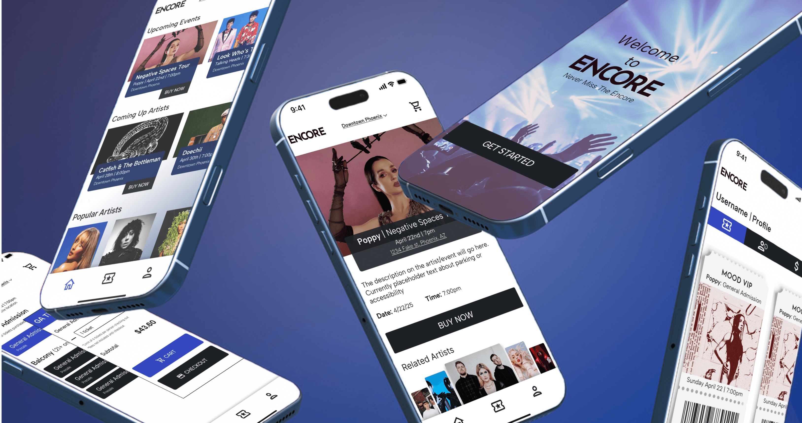
A smart ticketing experience for unforgettable moments
Encore
Encore
Encore
Encore
desktop
mobile
UI/UX design
Encore reimagines the concert ticketing experience by solving the fundamental problems that have plagued music fans. Where existing platforms create barriers, Encore builds bridges, delivering a sleek, intuitive interface that transforms the chaos for tickets into a journey toward unforgettable experiences.
Encore reimagines the concert ticketing experience by solving the fundamental problems that have plagued music fans. Where existing platforms create barriers, Encore builds bridges, delivering a sleek, intuitive interface that transforms the chaos for tickets into a journey toward unforgettable experiences.
Encore reimagines the concert ticketing experience by solving the fundamental problems that have plagued music fans. Where existing platforms create barriers, Encore builds bridges, delivering a sleek, intuitive interface that transforms the chaos for tickets into a journey toward unforgettable experiences.

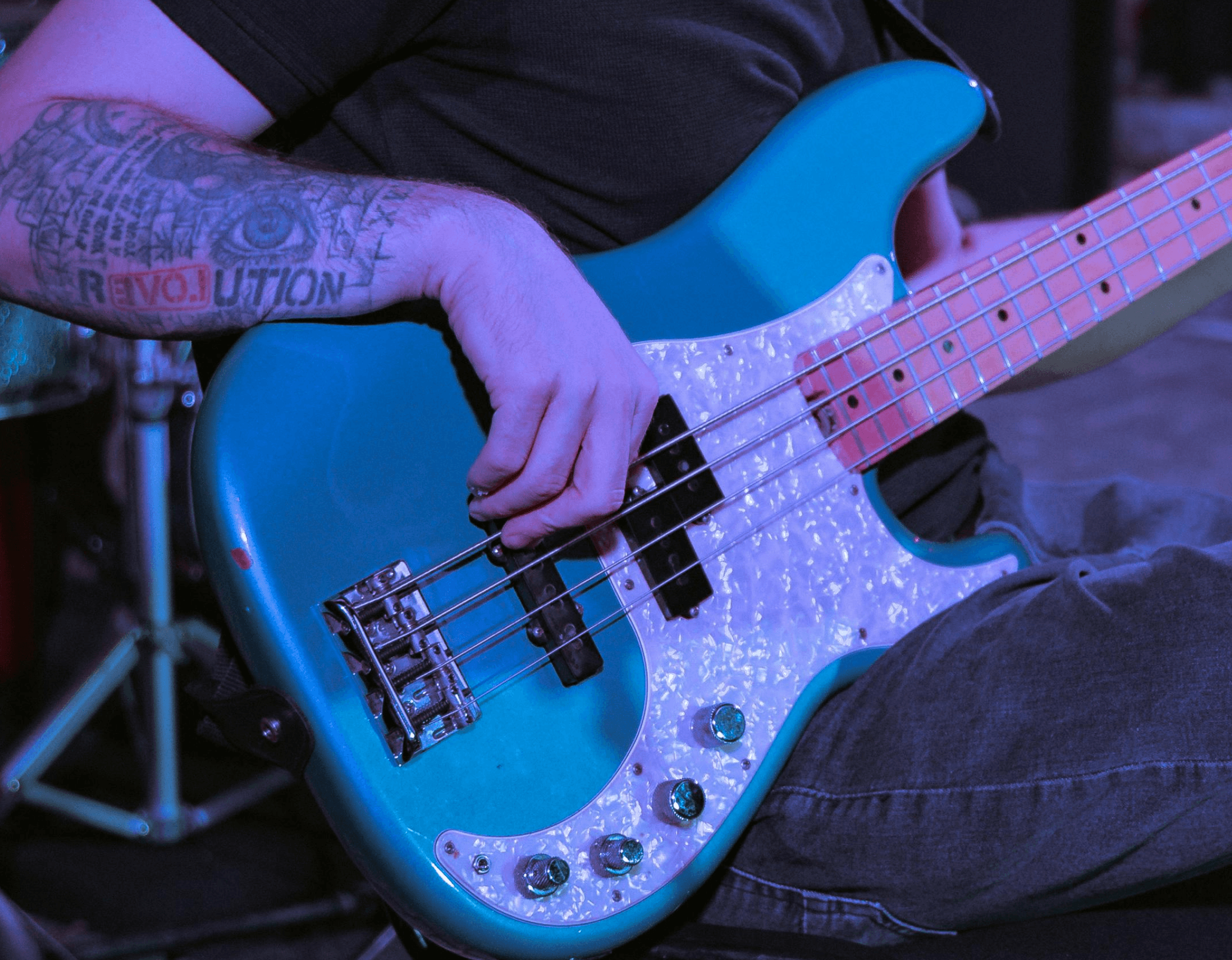
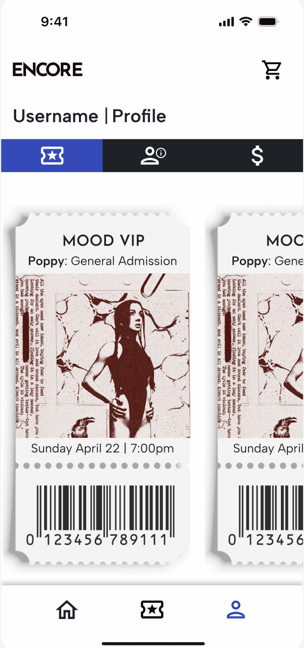
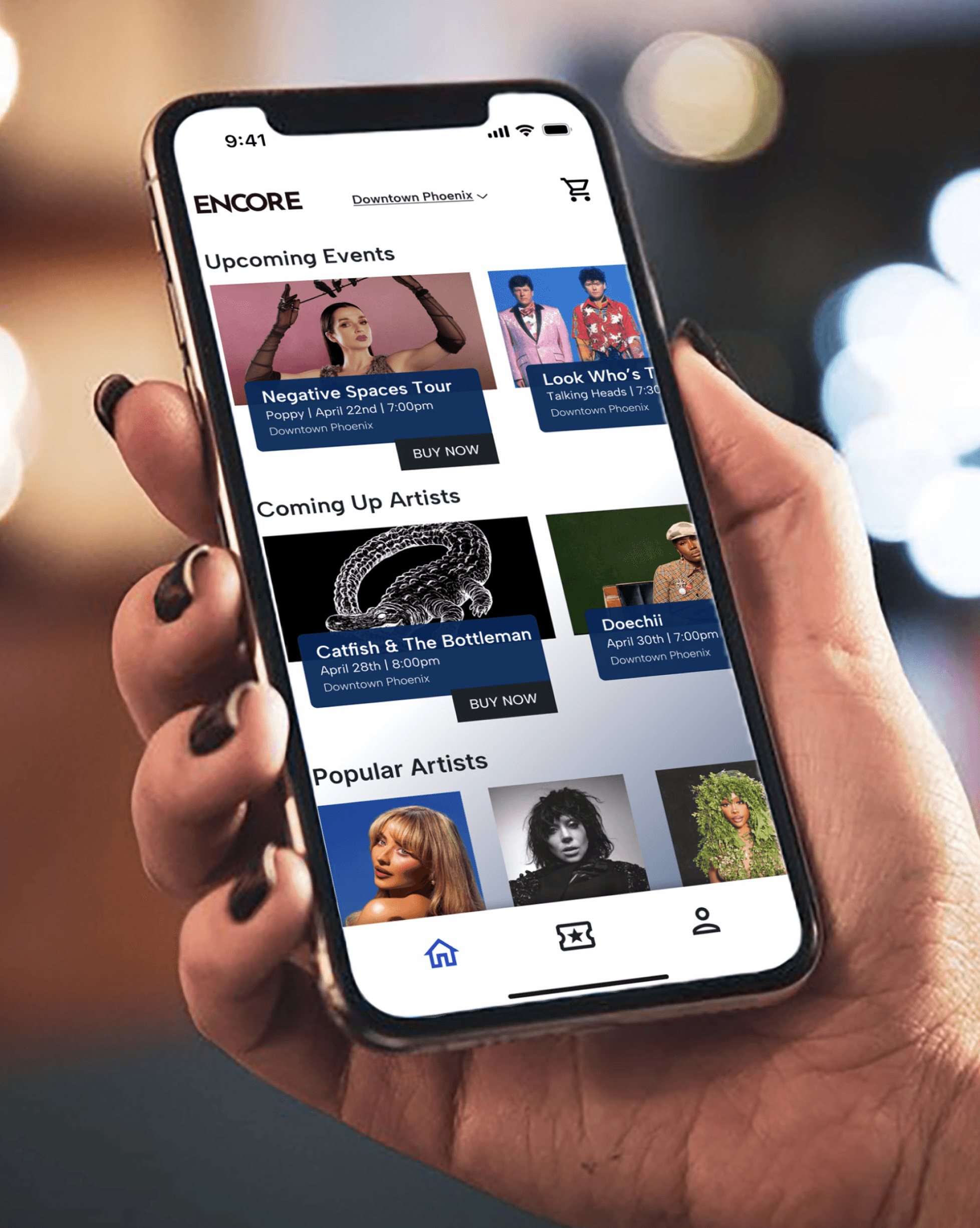
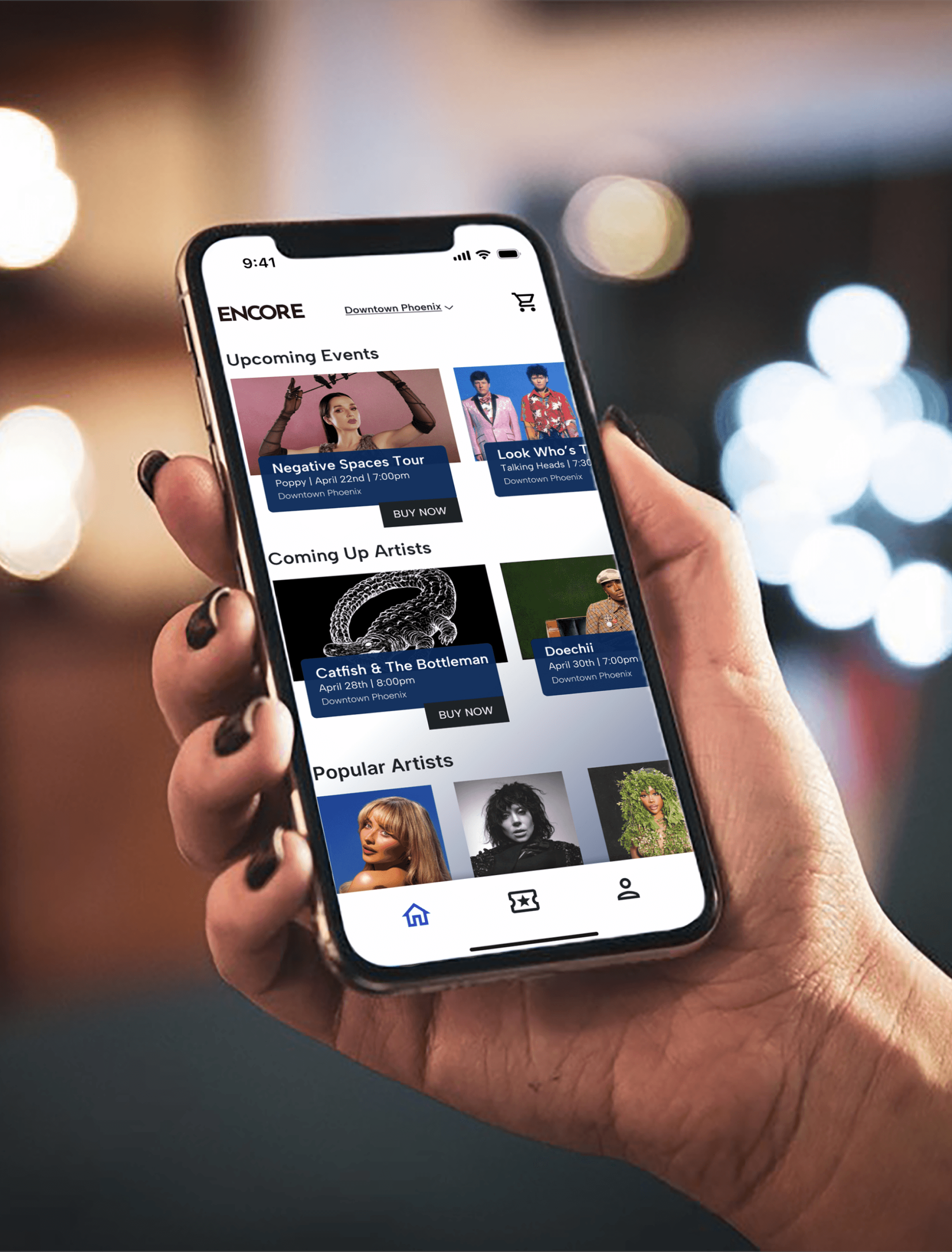
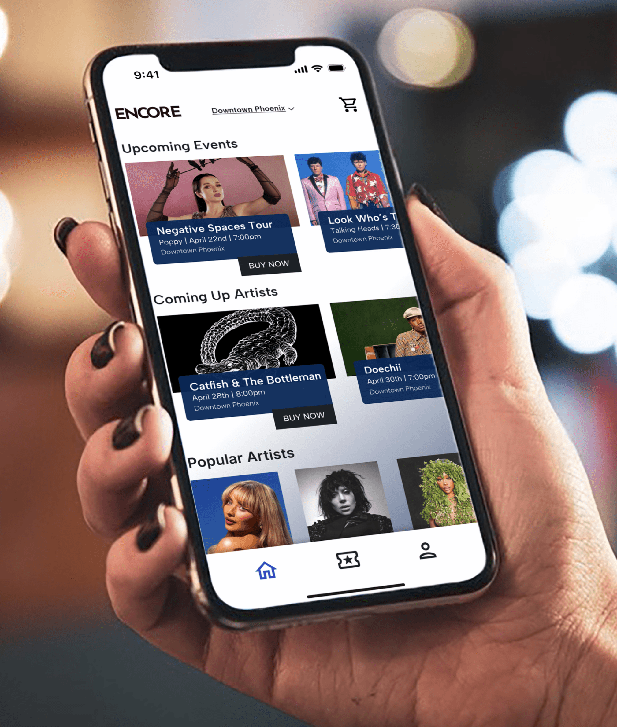
From the initial wireframing stage clear information hierarchy and navigation patterns were established through multiple rounds of iterations and accessibility testing to ensure optimal user experience for all abilities. The color palette strategically employs a gradient system of light blue, dark blue, and dark grey tones instead of traditional black, achieving good contrast ratios while maintaining the modern, and elegant appearance. Sans typefaces were used interchangeably for all text and headings to ensure simple and fast readability where user are jumping quickly between pages for their tickets.
From the initial wireframing stage clear information hierarchy and navigation patterns were established through multiple rounds of iterations and accessibility testing to ensure optimal user experience for all abilities. The color palette strategically employs a gradient system of light blue, dark blue, and dark grey tones instead of traditional black, achieving good contrast ratios while maintaining the modern, and elegant appearance. Sans typefaces were used interchangeably for all text and headings to ensure simple and fast readability where user are jumping quickly between pages for their tickets.
From the initial wireframing stage clear information hierarchy and navigation patterns were established through multiple rounds of iterations and accessibility testing to ensure optimal user experience for all abilities. The color palette strategically employs a gradient system of light blue, dark blue, and dark grey tones instead of traditional black, achieving good contrast ratios while maintaining the modern, and elegant appearance. Sans typefaces were used interchangeably for all text and headings to ensure simple and fast readability where user are jumping quickly between pages for their tickets.
From the initial wireframing stage clear information hierarchy and navigation patterns were established through multiple rounds of iterations and accessibility testing to ensure optimal user experience for all abilities. The color palette strategically employs a gradient system of light blue, dark blue, and dark grey tones instead of traditional black, achieving good contrast ratios while maintaining the modern, and elegant appearance. Sans typefaces were used interchangeably for all text and headings to ensure simple and fast readability where user are jumping quickly between pages for their tickets.
Design Process
Design Process
The prototyping phase added additional animations of smooth transitions between film cards, subtle hover effects that make browsing feel more engaging, and scroll-triggered animations that gradually reveal content, all add a new depth to the site. The animations help guide users through the interface naturally, making the transition from discovery to engagement feel effortless. To complete the project, I developed a comprehensive developer handoff with detailed specifications of the user interface and hover interactions on specific sections and other important information needed when it passes into development.
The prototyping phase added additional animations of smooth transitions between film cards, subtle hover effects that make browsing feel more engaging, and scroll-triggered animations that gradually reveal content, all add a new depth to the site. The animations help guide users through the interface naturally, making the transition from discovery to engagement feel effortless. To complete the project, I developed a comprehensive developer handoff with detailed specifications of the user interface and hover interactions on specific sections and other important information needed when it passes into development.
The prototyping phase added additional animations of smooth transitions between film cards, subtle hover effects that make browsing feel more engaging, and scroll-triggered animations that gradually reveal content, all add a new depth to the site. The animations help guide users through the interface naturally, making the transition from discovery to engagement feel effortless. To complete the project, I developed a comprehensive developer handoff with detailed specifications of the user interface and hover interactions on specific sections and other important information needed when it passes into development.
The prototyping phase added additional animations of smooth transitions between film cards, subtle hover effects that make browsing feel more engaging, and scroll-triggered animations that gradually reveal content, all add a new depth to the site. The animations help guide users through the interface naturally, making the transition from discovery to engagement feel effortless. To complete the project, I developed a comprehensive developer handoff with detailed specifications of the user interface and hover interactions on specific sections and other important information needed when it passes into development.
Design and Development
Design and Development
Creative Vision
Creative Vision
Creative Vision
Explore More

Contact ME
Contact ME
Contact ME
Contact ME
A smart ticketing experience for unforgettable moments
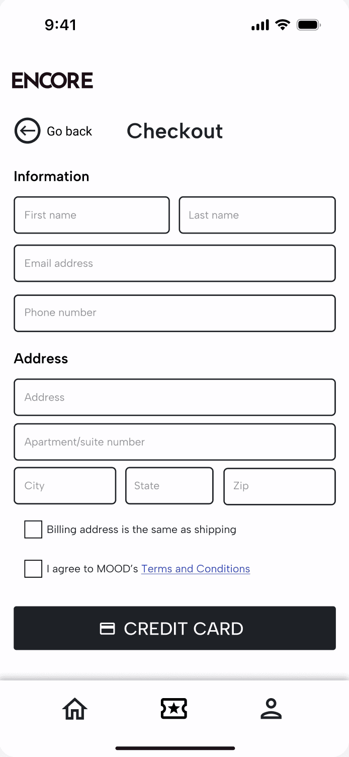
UI/UX design
mobile
desktop
A smart ticketing experience for unforgettable moments
Encore reimagines the concert ticketing experience by solving the fundamental problems that have plagued music fans. Where existing platforms create barriers, Encore builds bridges, delivering a sleek, intuitive interface that transforms the chaos for tickets into a journey toward unforgettable experiences.
Design Process
Design and Development
Contact ME